Choose your screenshot sizes
Choose the stores and device families your app supports. Start with one output size and one useful app screen so you can develop the message and composition together.
Add the other required sizes when the first design is ready to review. Presets set the output dimensions and format rules, while you decide which pages belong in the release.
- Start with the stores you will actually publish to.
- Choose one representative size for initial composition.
- Start with the sizes you need for the first release.
Create the project
Choose the target stores and presets, then name the project for the app and release stream it represents. The project keeps pages, managed assets, languages, target selection, and output settings together.
Imported assets are copied into the managed project directory by default, so the composition does not silently depend on a temporary Downloads path.
Build the first page
A page combines one background with an ordered list of screenshot, image, text, shape, group, and device-frame layers. Start with the application capture and its single strongest message before adding decoration.
Name the page for its product claim, not its position. A name such as Fast capture remains useful when the page order changes; Screenshot 2 does not.
- Keep shared logos and decorative assets in the project library.
- Use groups for elements that should move together.
- Use a device frame only when it improves recognition.
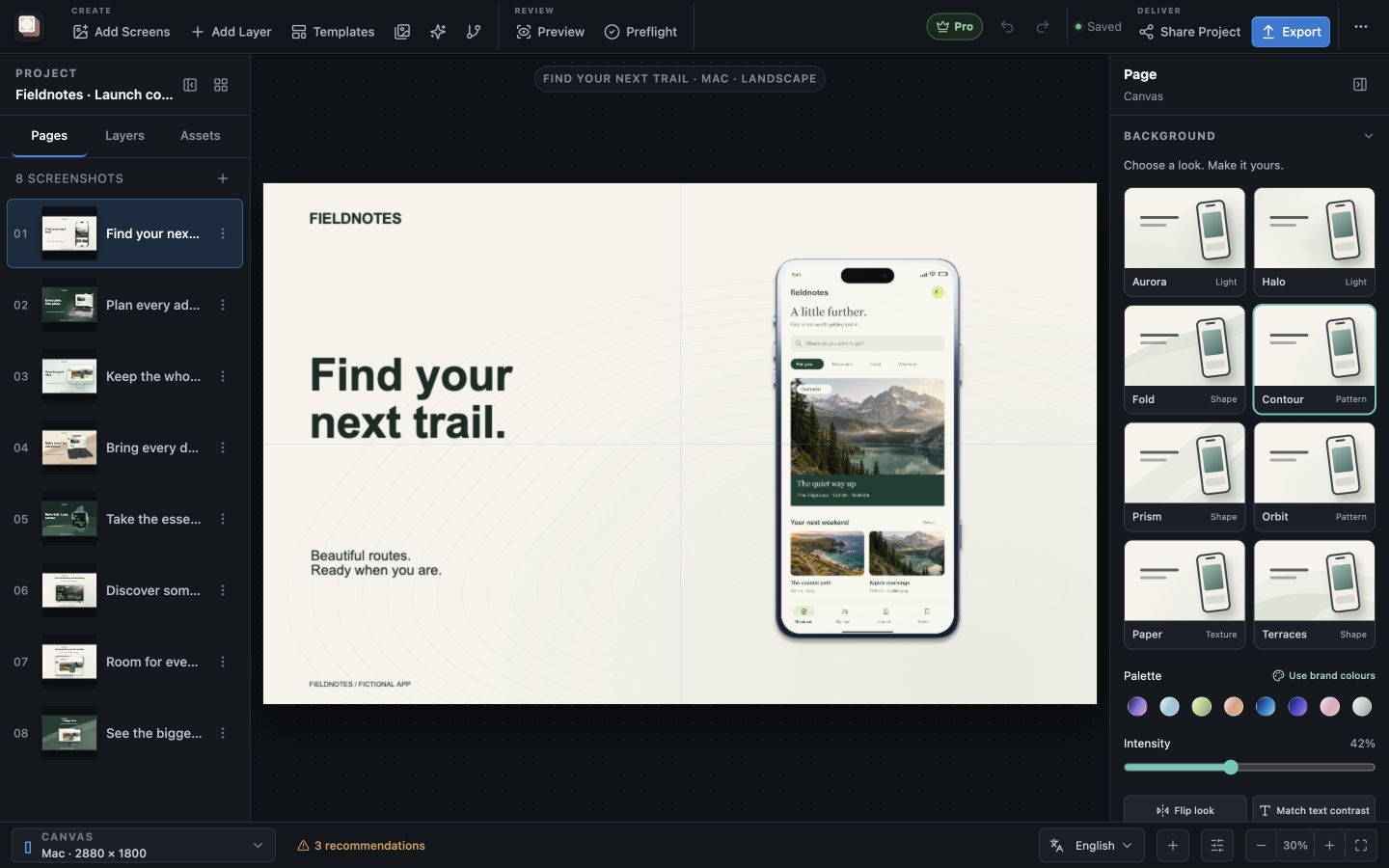
Adapt the layout to another size
The layout adapts as the canvas size changes. Preview the other selected outputs and check the headline, device frame and visible app content in each shape.
If a particular size needs a different arrangement, use a size-specific position, dimension or visibility adjustment. Keep shared changes in the main composition so the next update remains easy to review.
- Align important content to stable guides.
- Avoid tiny fixed offsets that only look correct at one size.
- Preview the largest and smallest selected outputs before continuing.
Choose a background that supports the message
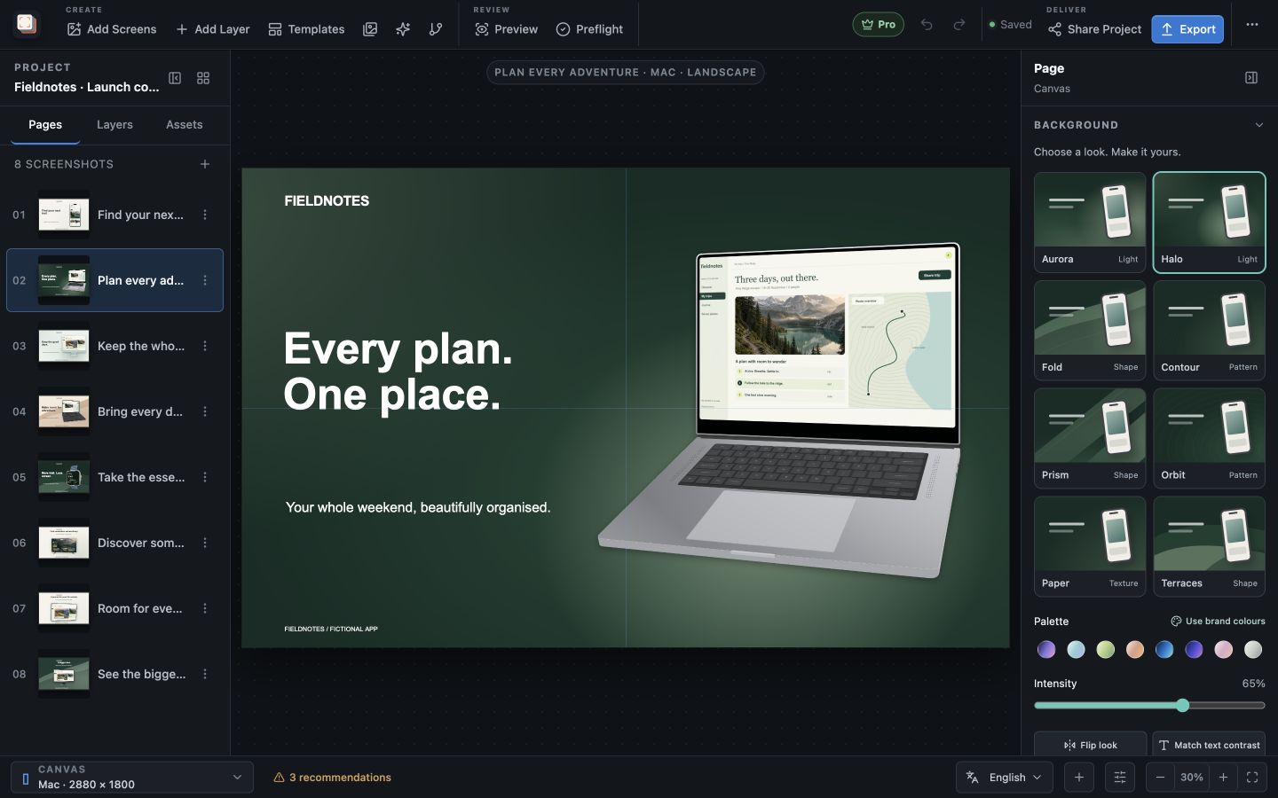
Open the page Background panel and try Aurora, Halo, Fold, Contour, Prism, Orbit, Paper or Terraces. Choose a palette or select Use brand colours, then lower the intensity if detail competes with the headline.
Switching the look preserves custom colours. Use Flip look to move its emphasis and Match text contrast to update the text colour on the current page. Choose Apply background to all pages when the complete set needs the same treatment.
Duplicate and vary intentionally
Duplicate a strong page when the layout remains useful but the message or capture changes. Keep common brand treatment consistent, then make the minimum content changes needed for the next product claim.
Do not duplicate entire pages merely to handle a language or output size. Languages and per-size overrides exist specifically to prevent that maintenance problem.

Keep the project for your next release
Your edits autosave locally, and recovery snapshots help restore interrupted work. Keep the editable project as well as the exported images so you can return to its captures, headlines and design choices.
Use the portable project workflow when moving the design to another computer or handing it to someone else. That preserves the source project instead of asking them to reconstruct it from finished images.
- Resolve a recovery prompt before making new edits.
- Keep project-owned source assets with the project.
- Export final output separately from the editable project.