Store screenshots often need more than a capture and a headline. A rating, review, proof point, privacy message, or small visual accent can help a page communicate quickly—but only when it still belongs to the layout instead of feeling pasted on afterward.
Screen Studio Kit 1.1 adds a native library of stickers and widgets for exactly that part of the composition. They are built into the existing scene model, remain editable after placement, and are rendered by the same native export path as the rest of the screenshot.
01 / The missing layer
Useful callouts without another design file
Before 1.1, Screen Studio Kit already handled application captures, images, text, shapes, groups, and device frames. That covered the foundation of a store screenshot, but common marketing patterns still had to be assembled manually from several layers.
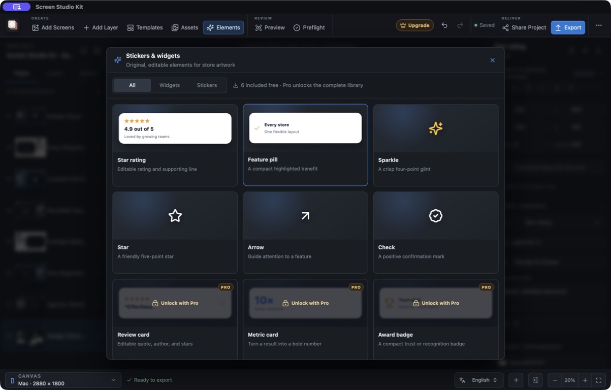
The new Elements panel turns those patterns into reusable starting points. A rating can be added as one object instead of five stars, multiple text layers, a background, and a shadow. A feature pill can be placed and resized without rebuilding its internal spacing. Decorative marks arrive as crisp, editable scene elements rather than imported bitmap files.
02 / What shipped
Fourteen stickers and nine widgets
The sticker collection includes sparkle, star, heart, bolt, arrow, check, plus, orbit, cursor, confetti, shield, rocket, laurel, and megaphone styles. They cover the small accents I reach for most often when directing attention or adding a little energy to a release page.
The widget collection includes star ratings, review cards, metric cards, award badges, icon orbits, feature pills, store badges, download counts, and privacy badges. Their default copy is deliberately generic: it demonstrates the hierarchy, but the title, supporting text, rating, and other available fields are there to be replaced with claims that are accurate for the app being presented.
Six elements are included in Free: the star rating, feature pill, sparkle, star, arrow, and check. The one-time Pro purchase unlocks the complete element library.
03 / Scene-native
Placed once, still yours to change
Stickers and widgets are normal scene layers. They can be selected, moved, resized, rotated, reordered, hidden, locked, and adjusted per output size like other elements in a Screen Studio Kit project.
For stickers, the inspector exposes the style plus base and accent colors. Widgets add editable content, text and accent colors, corner radius, shadow, and an optional transparent card background. Rating and review widgets also support a rating from zero to five in half-star steps.
The catalog is a starting point, not a flattened asset.
That distinction matters when one composition has to survive different Mac, phone, tablet, or store-graphic dimensions. An element can participate in the responsive layout and receive a targeted size override instead of being baked into a single exported picture.
04 / Dogfooding
The 1.1 App Store screenshot was made in Screen Studio Kit
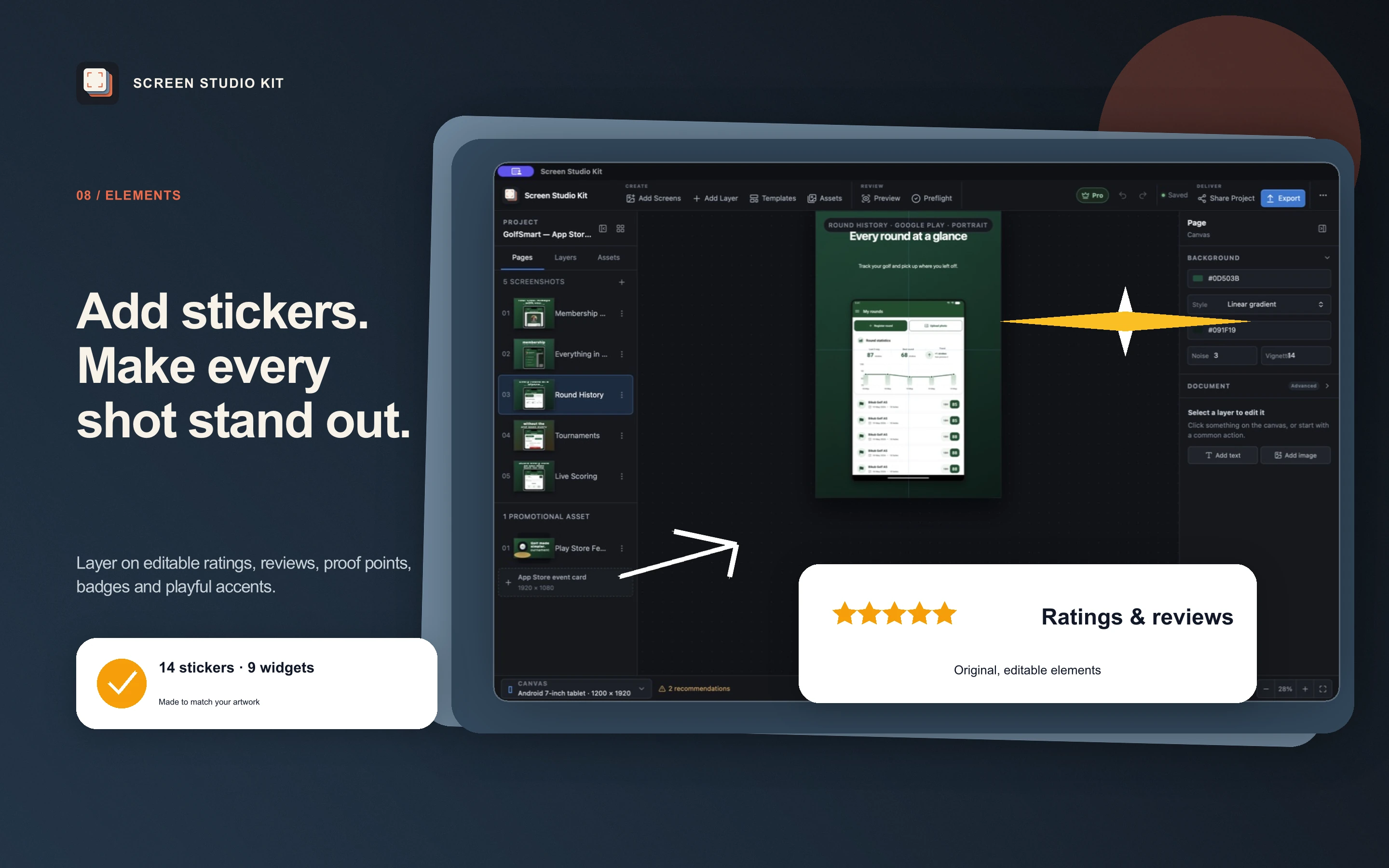
I added the new release artwork to the existing Screen Studio Kit App Store project, duplicated its visual system, rewrote the page for Elements, then placed a rating widget, feature pill, sparkle, and arrow from the new library. Preview and native export produced the final 2880 × 1800 Mac screenshot.
Version 1.1 makes the last part of a screenshot composition faster without turning it into a template-only workflow. The useful pieces are ready to place; the message, visual hierarchy, and final judgment still belong to the person shipping the app.