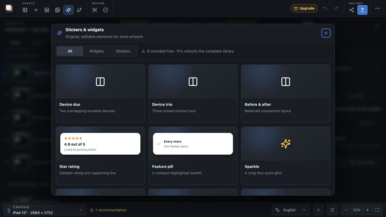
Capability overview
How can I use stickers and widgets in Screen Studio Kit?
Add 20 decorative stickers and 9 reusable widgets for ratings, reviews, metrics, awards, feature callouts, store badges, download counts, and privacy messages.
Every sticker is an editable scene layer with its own style, colors, size, position, rotation, and opacity.
Widget copy, ratings, colors, corner radius, shadow, and optional transparent card backgrounds remain editable in the inspector. Six elements are included in Free; Pro unlocks the complete library.
Widgets
Nine widgets for proof points and key facts
Widgets are small cards for the facts customers look for: Star rating, Review card, Metric card, Award badge, Icon orbit, Feature pill, Store badge, Download count and Privacy badge. Each one arrives with sample wording so you can see its layout straight away.
Widget content lets you change the Eyebrow, the Title (Author on a review card) and the Supporting text or Review, and set the number of Stars on Star rating and Review card widgets. Replace the sample figures and quotes with ones you can back up, such as your current average rating or a quote from a real review.
Match the widget to the point the page makes: a Metric card for one key number, a Privacy badge next to a screen that handles personal data, a Feature pill for a short capability label, or Icon orbit to show that the app works with several services. Store badge is an original, generic design with editable text, not an official store badge.
Stickers
Decorative stickers for emphasis
Stickers are simple original graphics for pointing, highlighting and adding character, from Sparkle, Star, Arrow and Check to Heart, Bolt, Rocket, Laurel, Megaphone, Chat, Globe, Location pin and Bell. An Arrow beside a new control or a Check next to a completed task directs the eye without extra text.
Use stickers sparingly. One or two accents per page support the message; more tends to compete with the interface you are trying to show.
Like widgets, stickers can be rotated and resized freely, so an Arrow can point at exactly the control you want to show. Each element also appears in the layer list, where you can rename, lock or hide it.
Styling
Match elements to your palette
Element appearance sets a Base and an Accent colour for stickers and widgets. Widgets also have a Text colour, Radius, Shadow and a Transparent card background option that places the content directly on the page background.
Size, position, rotation and opacity come from Layout & sizing, as for any other layer. Elements also follow the per-size tools, so a widget can be moved with Customize layout for this size or removed from a small watch output with Hide at this output size.
Free and Pro
Six elements in Free, the full library with Pro
Free includes the Star rating and Feature pill widgets and the Sparkle, Star, Arrow and Check stickers. The panel lists them first and marks the rest with a PRO badge; choosing a locked element opens the upgrade dialog. Pro unlocks the complete library.
Filter the panel with All, Widgets or Stickers. The device compositions at the top of the All view are included in Free as well.
In the workflow
How to use it
Open Stickers & widgets
Choose Elements in the toolbar and filter by Widgets or Stickers.
Add the element
Click a card to add it to the current page as an editable layer.
Write accurate content
Replace the sample rating, figure or quote with information you can support.
Match and place
Set Base, Accent and Text colours, then position the element so it does not cover important interface details.
Useful in practice
When to use it
Related manual
Create your first screenshot project
Set up target stores, organize assets, create pages, and build a reusable composition that survives the next release.
Read the guideDirect answers
Questions about stickers and widgets.
Which stickers and widgets are free?
The Star rating and Feature pill widgets and the Sparkle, Star, Arrow and Check stickers. Pro unlocks the complete library.
Can I change the text on a widget?
Yes. Widget content has fields for the Eyebrow, Title or Author, Supporting text or Review, and Stars where applicable.
Can a widget sit directly on the background without a card?
Yes. Turn on Transparent card background in Element appearance.
Are the elements images I have to recreate for each size?
No. Every sticker and widget is a scene layer that follows the shared layout and can be adjusted per output size.