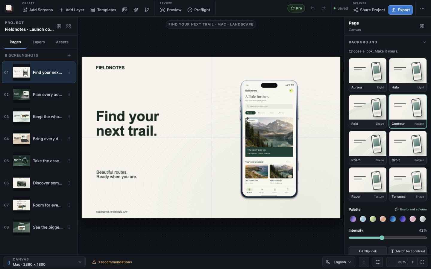
Capability overview
How can I use one scene, many devices in Screen Studio Kit?
Adapt a shared layout for iPhone, iPad, Mac, Apple TV, Vision Pro, Watch, Google Play, and Microsoft Store presets, with adjustments for each output size.
Build a screenshot gallery that shows buyers what your app does. Place screenshots in device frames, write clear headlines, and adjust the composition for each output size. Start with three free templates or unlock all 26 with Pro.
Output presets
Choose the store sizes your project will produce
A project keeps a list of selected output sizes. Choosing a size from the Canvas selector in the bottom bar switches the editor to that shape and adds it to the project if it was not selected yet.
Apple presets cover iPhone 6.9", 6.3" and 6.1", iPad 13", four Mac sizes, Apple TV 4K and HD, Apple Vision Pro and six Apple Watch sizes from Series 3 to Ultra 3. Google Play presets cover portrait and landscape phones, 7-inch and 10-inch tablets, Android TV and the 1024 × 500 feature graphic. Microsoft Store presets range from 1366 × 768 to 3840 × 2160, including a portrait desktop size.
Each preset carries its store's rules: pixel dimensions, accepted file formats and the minimum and maximum number of screenshots. Preflight and export use those rules, so a single-page Google Play phone set or a JPEG for a Microsoft Store size is caught before it reaches a store.
Promotional artwork
Give feature graphics and event cards their own page
Wide promotional formats rarely work as a resized phone screenshot. The Pages sidebar can add a dedicated page for the App Store event card (1920 × 1080), the Google Play feature graphic (1024 × 500) or the Microsoft Store super hero art (1920 × 1080).
That page exports only at its promotional size, and your regular screenshot pages are kept out of that output. If you need a one-off working size for sketching, Project settings has a Custom canvas option; export still uses the store presets.
Check every size
Review each output before you export
Review outputs lists every configured size with its dimensions, its store and the number of open issues. Select a size to see the pages in that shape, then choose Edit this output to jump back to the canvas at that size.
Preflight checks each size separately. It warns when device hardware or its shadow is clipped at a particular size, when text overflows at a size in a given language, and when an image may look soft, and it reports an error when a size has more or fewer pages than its store allows.
Every preset can be designed, previewed and checked in Free. Free exports one size per export within its allowance of 10 images per day; Pro exports all selected sizes in one batch.
In the workflow
How to use it
Select the store sizes
Pick the presets for the stores and devices your app supports, or add them from the Canvas selector as you go.
Design at one representative size
Get the capture, headline, frame and background right on the size most customers will see first.
Override only where needed
Switch sizes and use Customize layout for this size or Hide at this output size on the layers that do not fit.
Review and export
Check every size in Review outputs and Preflight, then export one size in Free or all selected sizes with Pro.
Useful in practice
When to use it
Related manual
Responsive layouts and localization
Adapt one screenshot system across aspect ratios and languages without turning every output into an unrelated page.
Read the guideDirect answers
Questions about one scene, many devices.
Which Apple Watch sizes are included?
Apple Watch Ultra 3 (422 × 514), Ultra 2 and Ultra (410 × 502), Series 11 and 10 (416 × 496), Series 9, 8 and 7 (396 × 484), Series 6 to 4 and SE (368 × 448), and Series 3 (312 × 390).
Can I export at a size that is not in the preset list?
Export uses the built-in store presets. Project settings → Custom canvas changes the working canvas only, which is useful for sketching, while the store presets remain the sizes you export.
What does a size-specific adjustment change?
Customize layout for this size changes the selected layer's position and dimensions at the current output only. Its text, colours, style and 3D rotation stay shared with every other size.
Which frame appears when I switch from iPhone to Google Play?
A frame set to Automatic for preset shows iPhone hardware on iPhone outputs and Android phone hardware on Google Play phone outputs. A frame set to a specific model keeps that model on every size.