How it works
How do I adapt screenshots for different store sizes?
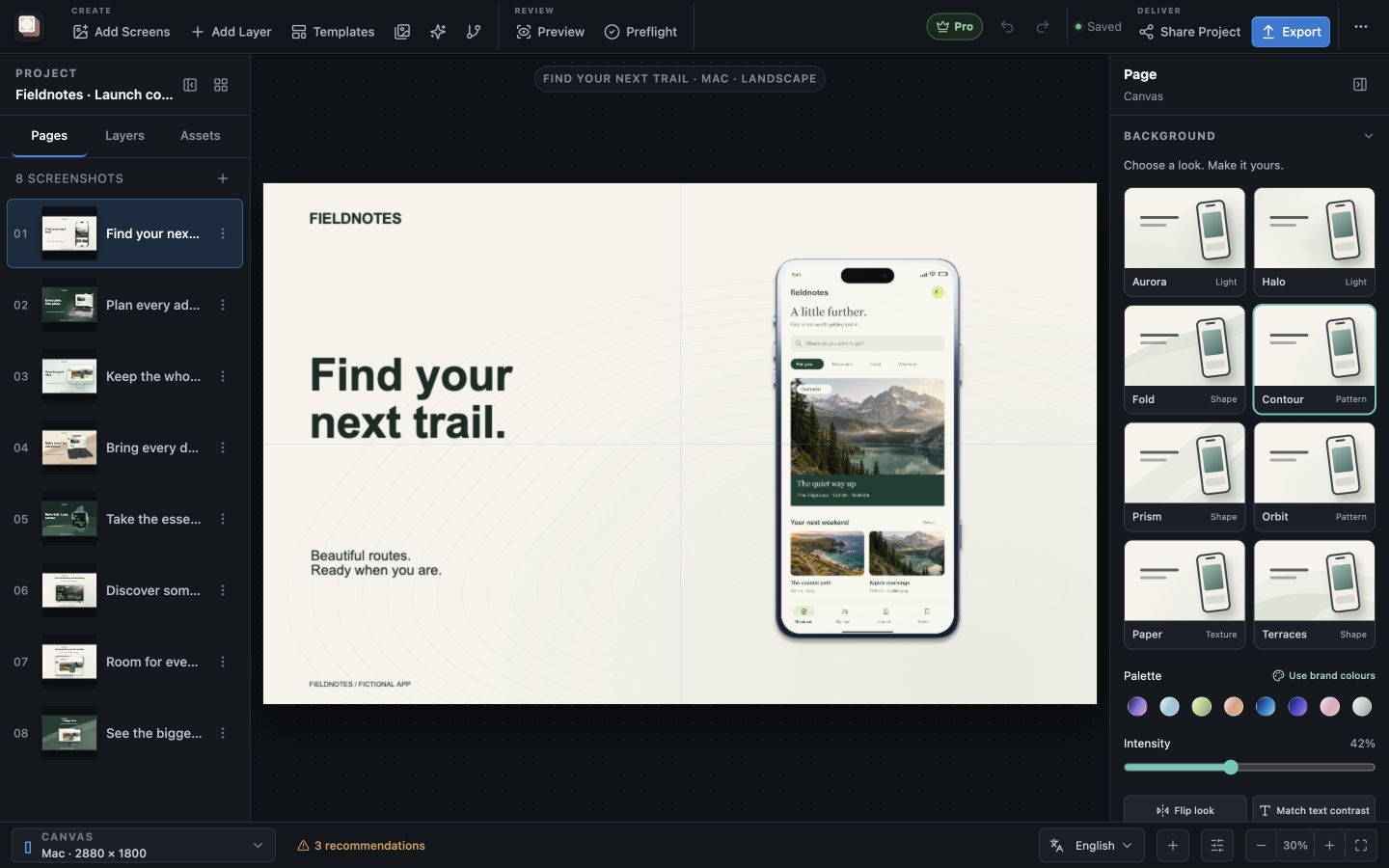
Screen Studio Kit adapts an editable composition to your chosen output presets. The capture, device frame, headline and background remain separate, so you can change their arrangement for a different aspect ratio. Preview each target and add size-specific adjustments where the design needs them.
Adapt the layout
Fit the composition to the output
A portrait phone listing and a wide desktop image offer different amounts of space around the device. Choose the appropriate output preset, then review the frame size, headline position and visible interface. Keep the important content readable in that particular shape.
Size-specific position, dimension and visibility overrides let a shared project accommodate those differences. When an update affects shared content, you can review the outputs together rather than searching for separate design files.
Deliver the set
Export the sizes you actually need
Select the device families and output sizes for your release. Validation checks dimensions, assets, bounds and target-format rules before you export.
Free exports one size and one language per export, within its daily image allowance. Pro adds multi-size, multi-language batch export so you can prepare the selected release outputs together.
Best for
Where this workflow fits.
- Producing phone, tablet, desktop, television, headset, and watch sizes
- Avoiding distorted text or device frames when aspect ratios change
- Regenerating every affected size after one shared edit
Relevant capabilities
What Screen Studio Kit brings to the job.
Practical workflow
Make it with your own app captures.
Select output presets
Choose the stores and device sizes needed for the release.
Preview each shape
Check the headline, device frame and app capture in each output.
Adjust the layout
Use size-specific position, dimensions or visibility where the composition needs it.
Export the required sizes
Export one target or use Pro to produce the selected batch.
Useful in practice
Direct answers
Before you get started.
How do I adapt screenshots for different store sizes?
Screen Studio Kit adapts an editable composition to your chosen output presets. The capture, device frame, headline and background remain separate, so you can change their arrangement for a different aspect ratio. Preview each target and add size-specific adjustments where the design needs them.
Which stores and device families are supported?
The preset catalog covers Apple device families, Google Play outputs, and Microsoft Store targets, including target-specific dimensions and format rules.
Can one layout serve several screenshot sizes?
Yes. Geometry is normalized to the active canvas, and specific output sizes can override position, dimensions, or visibility when a shared layout needs adjustment.
Go deeper
Adapt one screenshot system across aspect ratios and languages without turning every output into an unrelated page.
Read Responsive layouts and localization